The bottleneck was review capacity, not detection.
Kroger’s internal automation could only surface potential tax-code errors but couldn't resolve or inform which errors mattered first or why. That judgment lived with only the Corporate Sales Tax team, so we decided to amplify the tax experts' decision-making they had no way to work at the volume the system demanded.
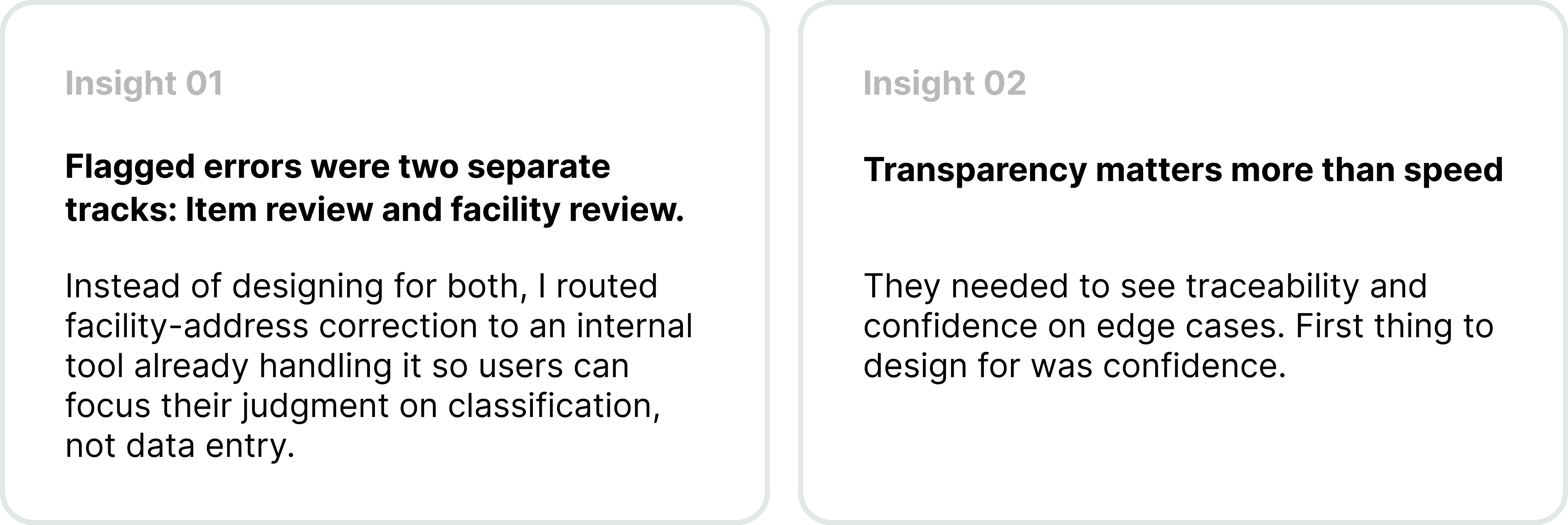
Two separate review jobs ran in parallel: fixing flagged items, and fixing facility data. Every new system just gave them more noise to sift through while their current workflow was also all manual reconciliation held together with Excel spreadsheets stitched across several processes. We couldn't compromise their daily workload. The real problem wasn't detection. It was capacity, confidence, and control.
Our Goals
01 How Might We enable tax experts to quickly identify, prioritize, and resolve high risk cases without adding headcount?
02 How Might We resolve exceptions using existing systems and data without rebuilding the tax automation infrastructure?
so that expert tax review is efficient enough to handle at scale, reducing at least 10-15% flagged cases without overwhelming the team's capacity or further compromising tax compliance.
My Role
As a full-stack solo product designer, I led continuous discovery and user, usability testing (partnered with UXR), facilitated alignment and technical workshops, and stakeholder presentations. I handed off final design prototypes for launch with two developers, maintaining consistency with Kroger's growing design system.
How do you build a scalable compliance tool for experts who were NEVER part of the original workflow?
Give the most accurate humans, in the loop, the leverage to work at machine scale. We stopped asking how to simplify or catching more errors but how a small expert team could resolve the riskiest cases in seconds, using the data and systems that already existed, without rebuilding any of the automation underneath. This confirmed our two main research insights:
We prioritized visibility and prioritization, deferring automation.
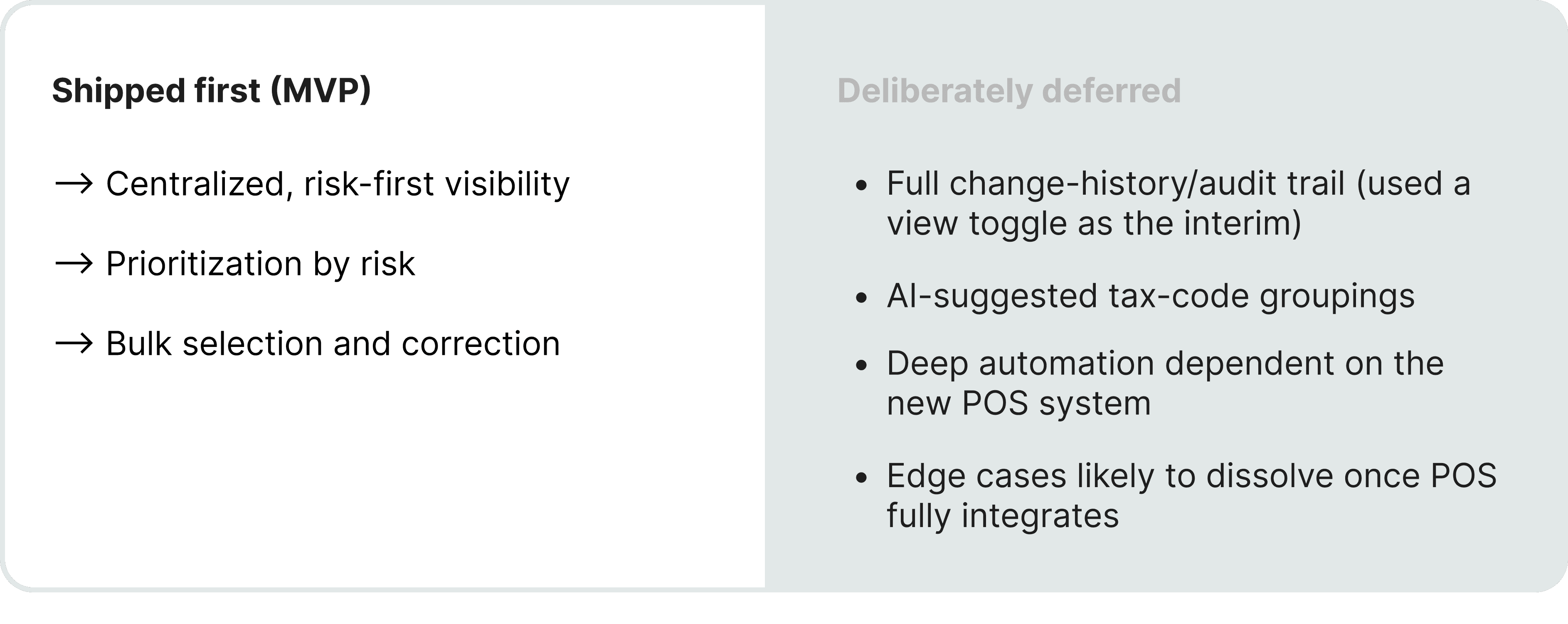
POS migration already in flight and the data still shifting under us, adding more automation would have meant building on ground that wouldn't hold. So working through impact-versus-effort and a MoSCoW cut with my PM and 2 tech leads, we strategized on gaining user trust with visibility and decision support first, then configuring AI groupings or smart suggestions for growth/post-launch.
When you're clearing hundreds of items a day, every extra click and every second of hesitation is a tax on your time. So each choice here traces back to a specific cost in the old way of working. Three mattered most:
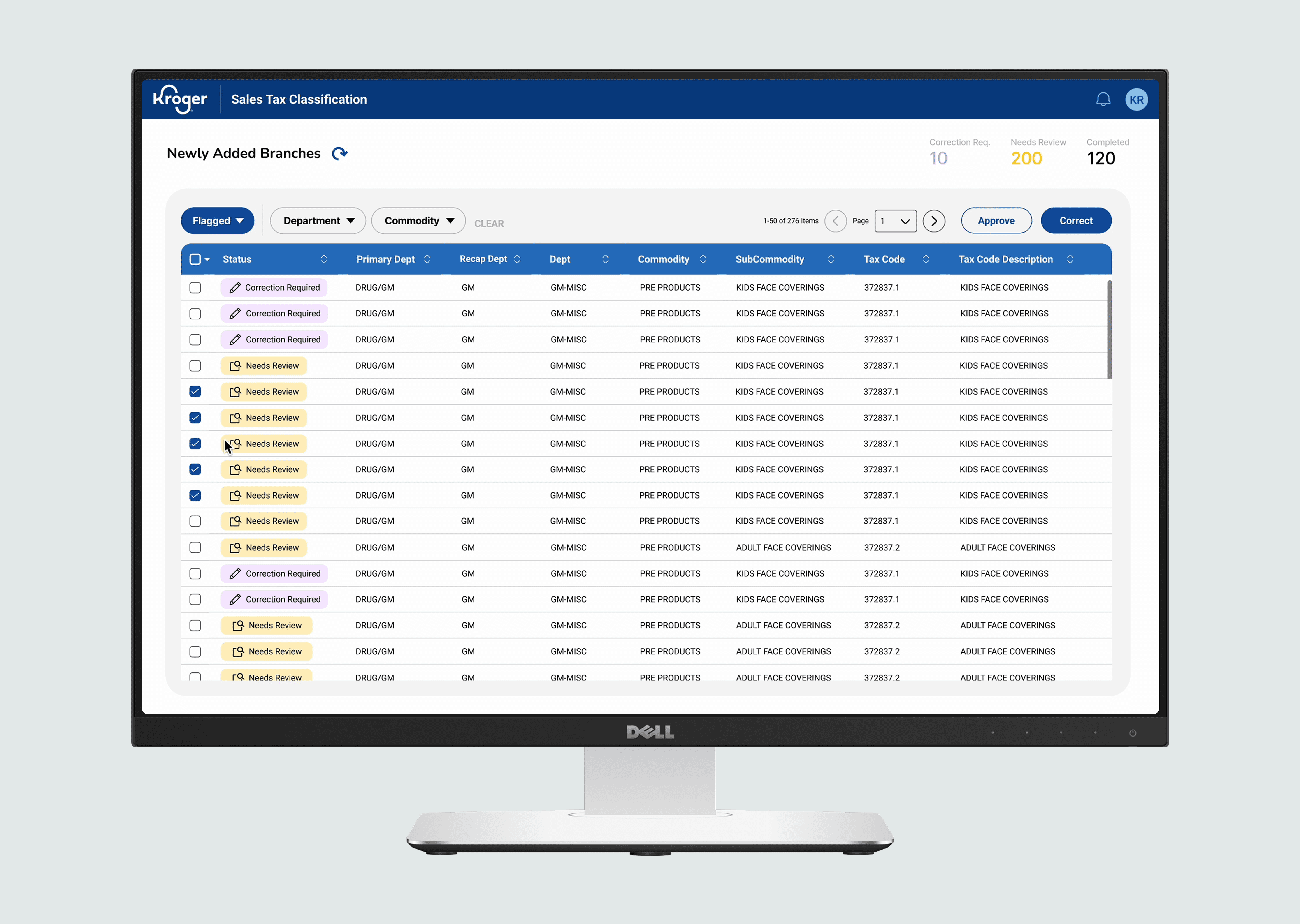
01 Risk-first table
(solves: prioritization) The table sorts by risk with color-coded flags, flagged-v.-all toggle, highest-stakes columns furthest left. Experts scan top to bottom, so a dense structured table beat any card layout. The whole point was to make severity obvious at a glance - so the work went into resolving items, not hunting for them.
02 Bulk & Quick-Approve
Solves: throughput. Fixing cases one at a time was never going to keep up without hiring more temporary teams. So similar cases resolve as a group (consistent bulk selection), an apply-to-all correction for a whole branch, and quick-approve for obvious passes
03 Always-visible filters
Solves: decision fatigue. Buried filters quietly slow experts down. I pulled th eones they reach for most into an open, always-visible layout, and kept action buttons consistent througout.
04 Item-level drill down
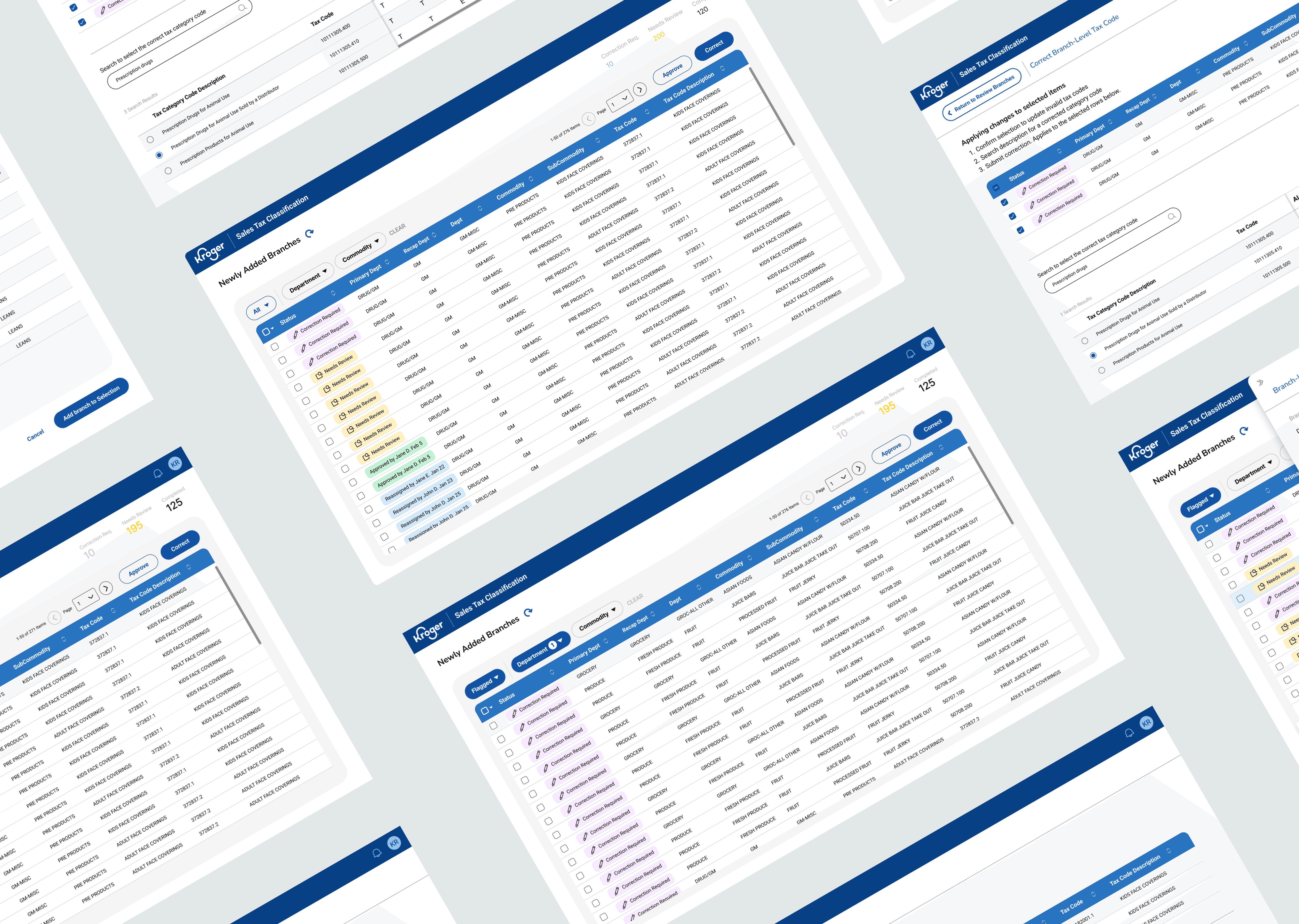
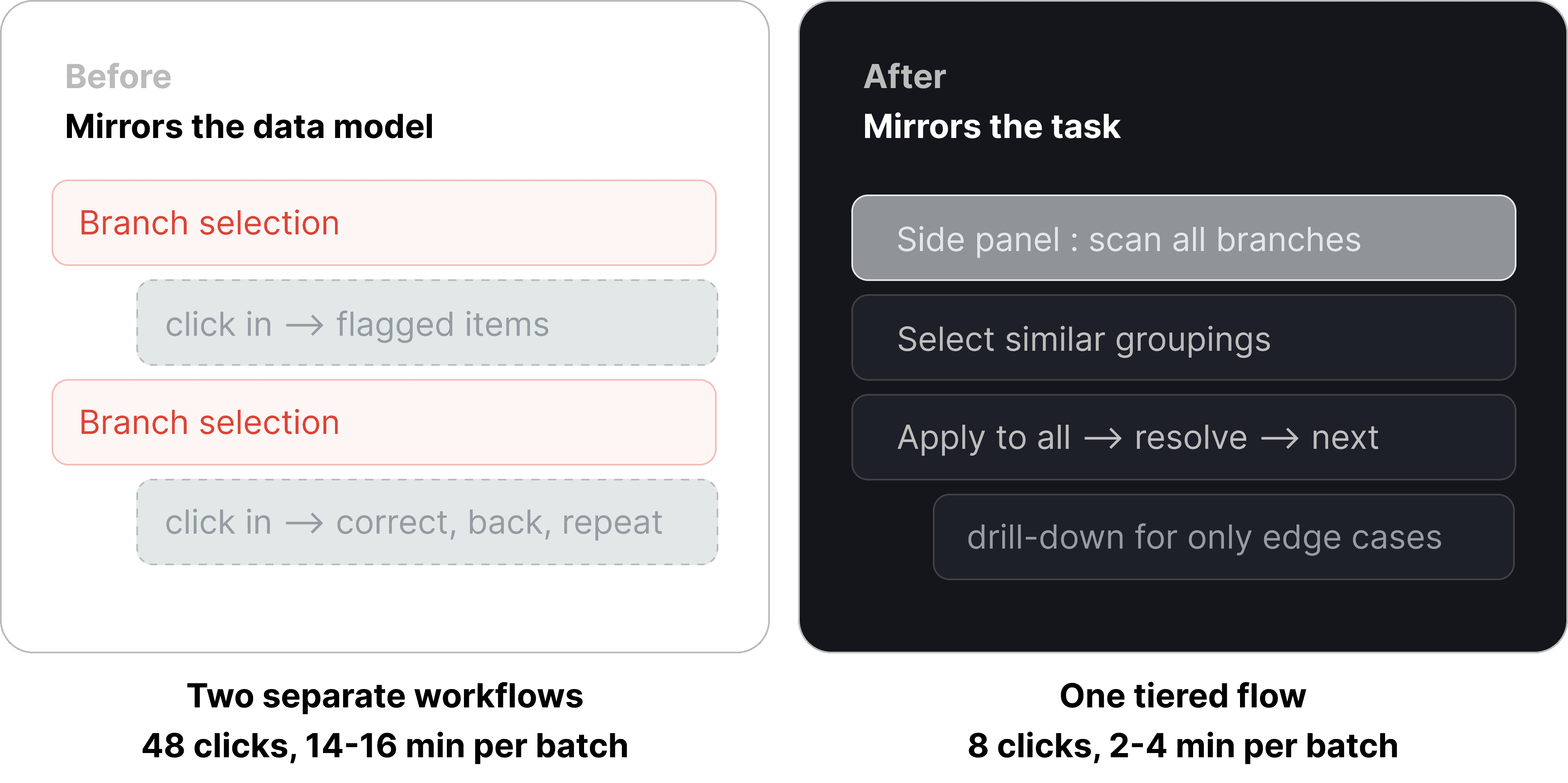
Solves: immediate view of all exceptions. We merged the workflows into a tiered layout, a side panel for quick scanning. This prioritized high-impact branch corrections first while providing clear drill-down for item-level edge cases.
The data model wanted branches first. Users needed exceptions first.
Here's where it got hard. The underlying structure locked us into a branch-to-item hierarchy — you couldn't see every flagged exception at once; you had to drill through branch rows to reach the items inside. My first design faithfully mirrored that model, with branch and item review as two separate workflows. Then a mid-project data reconfiguration turned that faithfulness into a trap: suddenly people were clicking into every branch twice just to finish a single job.
So I stopped designing for the database and started designing for the task. The rebuild was a tiered layout with a side panel for fast scanning — high-impact branch corrections up front, a clean drill-down for the item-level edge cases. Same infrastructure underneath; a completely different experience on top.
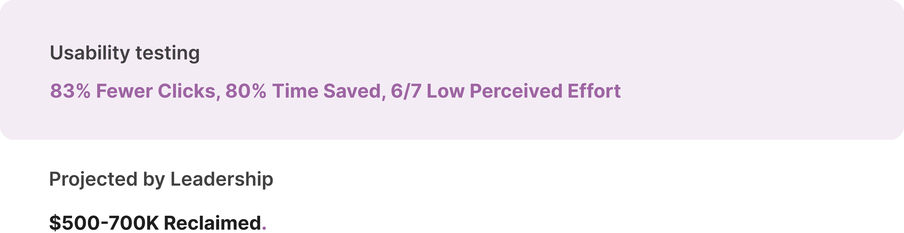
What I measured + what the business projected.
Then came the real test, putting it in front of our users who have to use it every day. I had power users run a bulk correction the old iteration and with manual reconciliation, then the same task in the new design. Our success criteria was able to address both user and business objectives. (The dollar figure is the business's projection from reclaimed labor hours, not directly measure, but the design metric results are mine).
If I had another month:
Balancing immediate needs with future vision
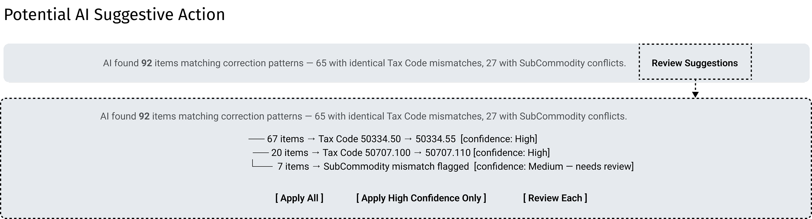
Through ongoing roadmap workshops, I’d prioritize quick wins while evaluating AI-powered tax code suggestive groupings benefiting users time-to-task and inform future systems.
Refining edge cases strategically
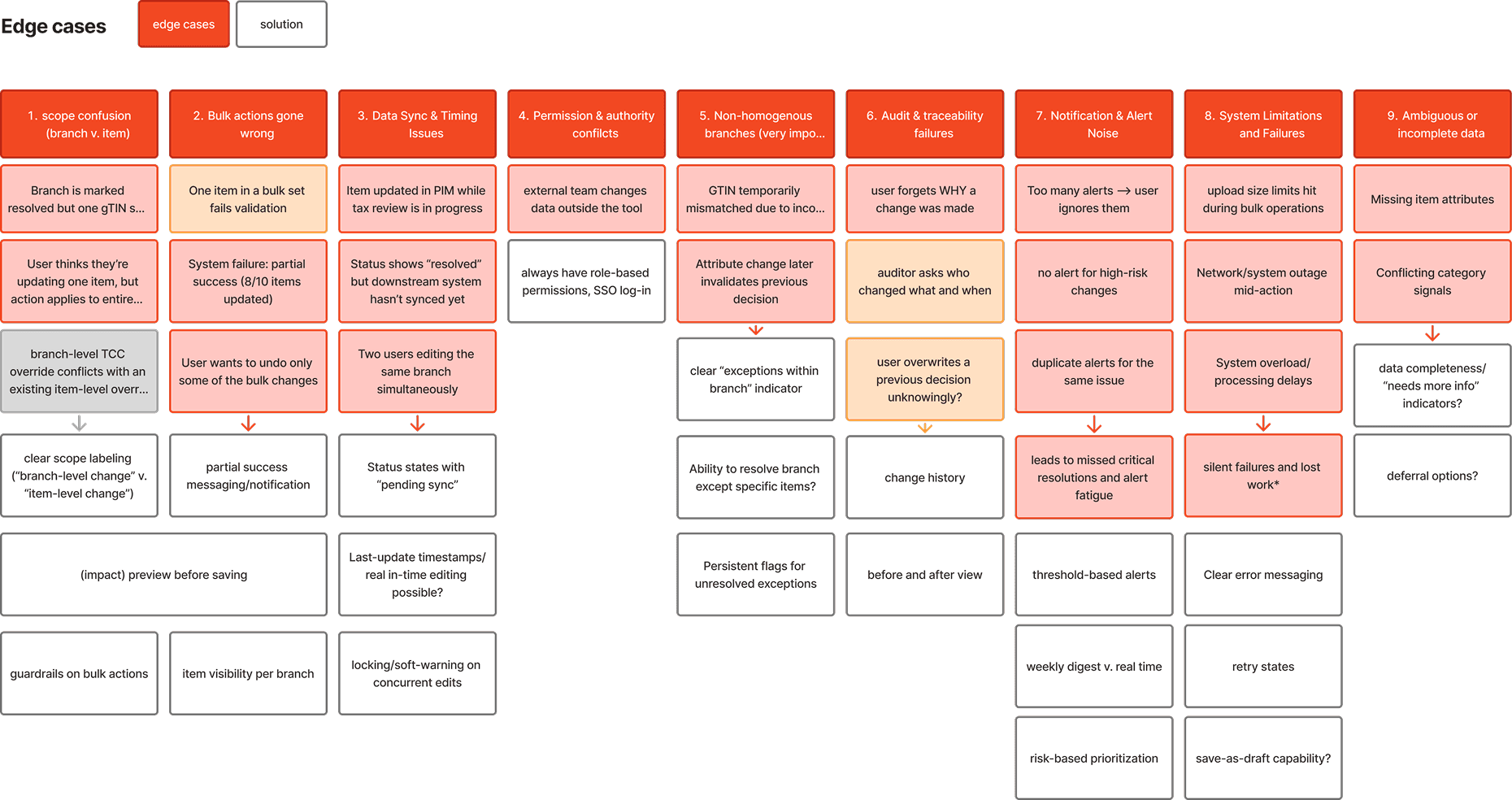
Using our Feature and UX Roadmap to tighten edge case handling based on impact and longevity, avoiding over-investment in issues that may resolve once the new POS system is fully integrated.